
In recent years, Marvel has seen fit to have Stark jump into his Classic armor on a semi-regular basis. And they need to stop. They find this act nostalgic or some kind of treat being retro, but they are wrong. Here are three reasons why it is nothing short of idiotic to keep using the Classic armor in the books.
3) There is no logic behind it.
Think about this situation. Your armor is trashed and you need another real quick to help your friends in battle. So what are you going to do? You are going to grab the next most powerful armor and go into battle with it. If this completely logical and common sense answer is your reply, you are wrong.
At least you are according to Marvel.
The correct answer was you are going to grab one of the least powerful and least advanced armors with the most wear and tear on it, mothballed for an extended period without use. For some reason this makes perfect sense to Marvel. To those that actually think things through, it is a head scratcher. The Classic armor cannot hold a candle to ANY armor that has followed it.
Here is a similar scenario. Let us say the Air Force has suffered heavy losses and are in need of fighters immediately. Constructing them would take too long, so they are forced to take planes out of mothballs and refurbish them instead. So which planes will they take? It would be an F-14, F-15, F-16 or some other more recent design made within the last few decades. However, if Marvel were in charge, they would be pulling the P-51 Mustangs from World War II out of retirement.
Why P-51 Mustangs? Because that is about the same the gap in technology between those fighters and the Classic and modern armors. The Classic is archaic and just like the Mustang if put onto today’s battlefield it would be trashed instantly. Go for an F-14, you may be out dated and a little outmatched, but you have a shot. Why use an armor that could make weak villains like Blacklash and Melter major foes instead of a later armor that made them cannon fodder?
I understand there needs to be a certain suspension of belief for comics, but for a company that has been hell bent on realism in recent years, they sure throw it out the window in this case.
2) It is the antithesis of Tony Stark
Tony Stark is a futurist. He is about cutting-edge technology and moving the world forward. Every new armor is (supposedly) more advanced than the previous design. So why then is he always so eager to take a monstrous step back to use an armor that he deemed unfit for duty years ago? It is only logical that Stark would grab the next most advanced armor, cursing the whole way how outdated it was compared to the newest model. But he knew it was his best bet so he went with it.
Yet instead, he keeps grabbing an outdated design for some nostalgic reason or other BS excuse. That is not Stark. If he knows the current armor cannot handle the situation he sure as hell is not going to don and older one that has technology he abandoned long ago. The Classic armor uses transistors and blinking lights instead of servos and digital readouts. That’s technology the real world stopped using years ago for combat purposes and I don’t see them digging up units that use that when in a bind.
1) The Armor’s time is over let it go
Seriously, the design is gone about thirty years now. It is outdated in every sense of the word, from the technology to power to aesthetics. Fifteen years ago, when Marvel designed a modern armor based on the classic there was massive backlash, and for good reason. The Classic armor is called that because that is what it is: classic. No one will deny that. The armor had its day and that day is long gone. It no longer has a place in stories other than a background image.
Sunday, March 21, 2010
Thursday, March 4, 2010
Review: Tony Stark Disassembled
The final issue of Tony Stark Disassembled was released today, ending the latest arc by Matt Fraction. This directly leads up to Siege, before it is settled that Bucky will take the Captain America mantle and the assault on Asgard begins. If you have not read issue #24 then I suggest you don't read this as there are spoilers.
Like World’s Most Wanted, I feel TSD had too much filler to be a good arc. A lot of time was spent on interactions between Pepper and Maria Hill, and the dream sequences taking place in Stark’s mind were very repetitive and frankly did not really go anywhere. I did not mind their use in general, but all in all they really did not add a whole lot to the story. I was also a bit annoyed by the parent issues that resurfaced in the end, feeling that has been done to death. It didn’t ruin things at all, but it is tiring.
Fraction wrote some funny moments in this series, including Potts and Hill learning they both slept with Stark when he went on the run, and recently with the exchange between Dr. Strange and the nurse. It helped to keep the mood light through an arc meant to be serious and intriguing.
Rhodey made appearances in this arc, but was completely inconsequential. Even after being shot by the Ghost, his importance in the story was completely limited.
Speaking of the Ghost, I did not like the way he was portrayed. He seemed incompetent and at times a stereotypical villain who kept blabbering rather than doing his job to kill the good guy, a far cry from the Ghost we used to know. I liked how he defeated Dr. Strange and his own defeat by Stark, both neat and interesting. I am miffed at why he found a way to take out Strange so quick yet resorted to trying to strangle Stark.
The ending, just like WMW, was predictable yet entertaining. We all knew Stark was going to be back so the outcome was not in doubt. The surprise at the end was very nice, Stark having created the backup before all the events of Civil War and being appalled by the things that happened. I don't like retcons, but I have to say I love this one. Fraction basically said everything Stark did while having extremis was not really him, that his portrayal by writers like Mark Millar who went out of the way to write him out of character to get their own political points across was completely wrong. So in addition to being a good twist, we get the old, pre-extremis Tony Stark back, which many fans have been clamoring for quite some time. Big kudos to Fraction for this one.
Overall, I give Tony Stark Disassembled a C+. The arc was too slow and the first four issues there was not a lot that really happened. The dream sequences were boring and repetitive, too much character interaction and not a whole lot of action. The arc seemed to be nothing but a lead up to an ending, which was the only real strong point of this.
The next arc will show how good at writing Iron Man Fraction really is. With two years experience on the book and no major event to interfere, Fraction needs to show he can write a good mix of drama and action, the latter of which has been sorely lacking.
Wednesday, February 17, 2010
Three Suggestions for the Captain America Costume
Captain America, the Star Spangled Avenger. His costume is one of the most recognizable in comics, having changed almost none over the years. Even in different realities writers and artists are loathe to depart from the basic design. Though iconic, I do not think the costume is above being changed to some extent. Below I have listed three changes to the costume that I think would make it better. Of course, we technically have two Captain Americas running around now, the original Steve Rogers and the new Bucky Barnes. Each has a different costume so will require different adjustments (mostly).
Steve Rogers
1) Lose the scales on the torso
The scales to me just make the costume look…off. On the rare occasion, they do look good but for the most part, they are ill fit to the rest of the costume that is smooth. Making the whole costume scales would make Cap look like a porcupine or some other wild animal, so that option is out. I think it was better when the whole costume was smooth and uniform.
2) Darker Blue
I have never really understood the light blue. If his costume is the American flag, why does he not use a dark blue? Granted it depends on the colorist on just how dark it is, but I do not think I have ever seen it the actual dark blue of our flag.
3) Change the boot cuffs
When I see these, I think of pirates and apparel hundreds of years old, not super heroes. Honestly, when is the last time we have seen boots like this? It is just such an out of date style, even for comic books, that I cannot understand why it is kept around. The Ultimate Cap costume got it right by using more form fitting and realistic gloves and boots.
Bucky Barnes
1) Lose the shine
I know Captain America is supposed to be a ray of hope, but let us not take it literally. When contrasted against the non-shiny black of the rest of the outfit, to me it clashes.
2) Colors on the legs
I do not think there is a good balance to this costume at all. All the color is situated on the head and torso, with nothing but black on legs and small red gloves. While a hefty dose of black can be fine, there is too much of it. At least make the boots a different color.
3) Boot cuffs
Just like Rogers, the boot cuffs are not only ridiculous looking but completely outdated. Even being all black they still do not look good .
Thursday, February 11, 2010
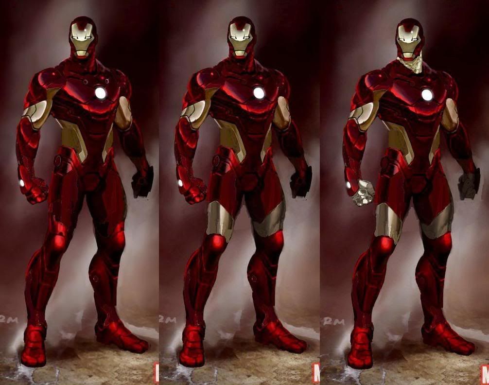
3 Aesthetics of the New Armor that Need Changed
It has been about a month since Marvel showed the world Iron Man’s new armor, and we have all had time to take it in. (If for some reason you have yet to see it, click the link below). Personally, I am liking it less than I initially did, and I have boiled it down to three factors that are also the primary gripes of other fans that I have heard. So here are three aspects to the new armor that, hopefully in the near future, Marvel will correct from fan complaints. These are ordered in what I have determined to be the more voiced displeasures.
http://s590.photobucket.com/albums/ss343/IrOnPaTrIoT/?action=view¤t=RMIN.jpg
3) Covering only one part of the body and not another
There are three instances of this: the triceps are covered and not the biceps; the back of the thighs are covered and not the front; and the fingers are covered but not the thumb. I cannot figure out a reason for this at all. They are awkward, and while not enough to ruin the design it would no doubt look better should these things were either fully covered or not at all.
2) Gaps in the red
Culprits include the shoulders, forearms, ankles and back. Especially the back. There is no rhyme or reason why there are gaps there, being little more than distracting. The back especially makes the armor look like it is a suit to wear to the gym rather than fight in. I keep thinking that Under Armor designed this particular suit because of it. It looks like the suit is wearing a workout shirt and lifting gloves. I think the red sections are supposed to coincide with human muscles groups, but regardless it is very distracting and impractical.
1) LED’s
I do not care if these actually have function (which I have a feeling they do not) they need to go. Placed in random places (inside ankles, shoulders to name a few) they attempt to give the suit a high tech feel by placing lights all over the armor. Unfortunately, the attempt fails. Some fans say they are meant for flight stabilizing or weapons discharge, but that theory does not hold up too well because of the odd placement. On the inside ankles is about the last place you want weapons firing and it will not help in flight stabilization much. In addition, what would be the need of having six LED’s on the chest? The hips I do not think make much sense either.
So there are three things that myself and others feel would make the armor look much better. I get they want something futuristic, but they make the same mistake that many make when predicting the future: people will not abandon practicality. Looking at this armor reminds me of seeing an old 1950’s video predicting what things would look like in the 2000’s. Those predictions were not even close to be right, because why would people abandon something that works? This futuristic attempt does not work because it is not practical, and frankly in some ways is outright screwy.
Linked below are my attempts at a photoshop (excuse my poor skills) that would to introduce these three fixes into the armor.
http://i134.photobucket.com/albums/q109/JWeigler/ArmorComparison-2.jpg?t=1263244535
Friday, February 5, 2010
Ideas for Ultimate Alliance 3
Just a heads up, this article is a bit long and if you have no interest in the Ultimate Alliance games you probably will not want to bother reading it.
With the release of Marvel Ultimate Alliance 2, I came away disappointed on the development, and by that I mean how it advanced from the first game. And I was not the only one as many felt the game was merely a rehash, just with different settings. I do not own the game for lack of a next gen system, but my friends have also told me not to get it. There were two things I was very disappointed to hear about. First was that it played like the first Ultimate Alliance which left a lot of room for improvement, and frankly I felt was a downgrade over the X-Men Legends II style. Secondly were the characters and costumes.
Game Play
When it comes to game play, a few quick and easy things would help greatly. They did good in ridding the super attack and did the power combination, which was key because the super attacks in UA were weak and lame. What they need to do is make more powers available at once. Clicking one of the side triggers brings up an option to choose between three mutant powers and the combo attack. Use one of the other triggers to do the same, but different powers. The more a player has immediately available the better. Also on the subject of powers, make all powers accessible to start. Forget this getting to level ten to get a specific power; just start them off weak like the others.
Also like X-Men Legends II let the player upgrade the stats. There were four categories and for each new level the player could distribute four points over those categories however they wanted. Bring that back because some characters lacked way too much in some levels (Ms. Marvel dying too easy and Thor not having strong melee attacks, both quite off base from the characters). Being able to customize and control aspects of characters is something all players want. If you want to keep the character balanced, set a maximum limit for each level.
Another aspect of X-Men Legends II that is better than UA was the use of energy and life packs over the orbs. Frankly, I hated the orbs, being reliant on their presence with the life and energy meters unable to regenerate at a quick enough pace. If you were running low on health, you had to go out of your way to destroy something in the area. It was a pain and distracting. Give me ten packs to use at my discretion and let the characters regenerate quicker.
Some powers a character can charge up and fire, so why not have powers that a player can use in a constant stream? For example, you have characters like Iron Man, Cyclops and Sunfire who can keep firing their respective blasts until they are exhausted. Why not be able to do the same in the game by holding the button down and letting it fire until the energy bar is drained? It is simple and effective and adds another dimension. Make the energy drain faster of course to balance it out, because it’s no fun just holding down a single button and killing any enemy that comes near.
Characters
Next is the choice of playable characters and their costumes. Most of the obvious ones have been included already in the past two titles. These characters are featured in their own book, team books, and popular enough to have movies made or being made about them.
I question the addition of Penance, doubting he would have been even considered if not for the Civil War theme. I also never have understood system exclusive characters. Just add all the damn characters for all the systems huh? People are not going to buy the game on two separate systems just for a single character.
I am surprised many designers have never caught on that customization and options are a major sticking point for players. The more characters the better, and the more you can do with each character the better. You do not need every Marvel character but give more than there is. Here are some I think would be a good addition, or at least be considered for the next title.
Ares- yes, the god of war that has made a resurgence when the Mighty Avengers title started. Who does not like fighting with a god of war?
Black Widow- not sure you could do much with her that is not being done with other gone-toting characters already.
Blade and Dr. Strange- I lump them together because thought they were good additions for the first UA, and not sure why they were removed the sequel (though Blade is a character specific to the PS2). Put them back in I say.
Cable- a boss in UA2, Cable has always held a fair amount of fan interest. You could give him a variety of guns and make him somewhat of a brawler.
Cyclops, Nightcrawler and Colossus- three of the more popular X-Men characters that made it into previous games, just make them playable characters. If they were done before, they can be done again.
Darkhawk- a bit iffy on this one, but his return during War of Kings may be enough for consideration. I would hardly be heartbroken if he was not considered though.
Hawkeye- you can give him a bunch of different arrows, and things that are not just piercing or explosive. Be creative and give him ones that wrap around enemies, set a trap, stun a small area etc.
Hercules- kind of the same as Ares, but I would rather see Ares since he is cooler.
Moonknight- a special character in the first UA, he is original enough to be included with the cast
Punisher- like Cable you can have him carry different weapons, though I think he would be more akin to Nick Fury in the first UA. Give him pistols, assault rifles, sniper rifles, grenades etc. to fill out his powers. Probably redundant because of Nick Fury but maybe use him in place of the latter.
Sunfire- the Japanese superhero who houses the power of the sun. May be a bit redundant because of the Human Torch, but I have always found him to be a much more interesting and far less annoying character. He was in X-Men Legends II so he was good enough for one game already.
Vision- his powers of density manipulation could make for some interesting moves, but I’d be a bit iffy on him. Not sure there is enough fan interest to put him here.
Costumes
Again, I mention customization. X-Men Legends II had nearly every costume the playable characters ever wore available. It was great because you could find a least one costume you liked. UA had four costumes for each character, which in most cases covered enough, but still lacked with some. UA2 has one alternate costume. One. I can only imagine laziness was the reason for this because logically there is no reasonable response. Why they would make only one alternate costume available when they have given so many more in the past is absurd. So, with my UA roster finalized, here is a costume list for each character.
Note:
AoA= Age of Apocalypse costume
HoM= House of M costume
Ares- current costume, mini-series costume
Black Widow- modern, classic, original (fishnet)
Blade- same costumes as the first UA, classic, day walker, ultimate and night stalker
Cable- modern, classic, HoM, Stryfe, AoA (Nate Grey X Man)
Captain America- modern, ultimate, WWII, US Agent, Bucky Cap, armored Cap
Colossus- modern, modern 2 (pre-death), classic, AoA, Acolyte, HoM
Cyclops- classic, modern, ultimate, 90’s, AoA, X-Factor, HoM
Daredevil- modern, original, AoA, armored, marvel knights
Darkhawk- modern, War of Kings, Evil Hawk
Deadpool- classic, modern, ultimate, AoA, Heroes Reborn (swordsman)
Dr. Strange- same as UA, classic, blue mage, ultimate, seer
Gambit- modern, AoA, horseman, ultimate
Ghost Rider- same as UA, original, classic, phantom rider, Zarathos
Green Goblin- Hobgoblin, demogoblin, ultimate
Hawkeye- classic, modern, ultimate 1, ultimate 2, 90’s
Hercules- classic, 90’s
Hulk- modern, Mr. Fixit, the Professor, green scar, Red Hulk
Human Torch- classic, modern, new marvel, uiltimate, heroes reborn
Iceman- classic, 90’s, AoA, modern, HoM, Bobby Drake, Ultimate
Iron Man- modern, Classic, Silver Centurion, neo-classic, War Machine, modular, heroes reborn, heroes return, tin man
Invisible Woman- modern, classic, new marvel, Ultimate, Malice, heroes reborn
Luke Cage- same as UA, new avenger, street, classic, power man
Mr. Fantastic- classic, modern, new marvel, ultimate, heroes reborn
Ms. Marvel- same as UA, ventura, classic, binary, warbird,
Nick Fury- same as UA, classic, stealth, ultimate, general
Nightcrawler- modern, classic, ultimate, AoA, HoM
Phoenix- classic (green costume), dark phoenix, white phoenix, Jean Grey classic, Jean Grey 90’s, Jean Grey AoA, Jean Grey HoM
Punisher- modern, classic, trench coat,
Spiderman- modern, Ben Reilly, Scarlet Spider, black costume, unlimited, Stark armor
Storm- classic, modern, AoA, extreme X-Men, Ultimate, 90’s, Morlock leader, queen of Wakanda, HoM
Sunfire- classic, modern, horseman, HoM
Thing- classic, modern, new marvel, ultimate, heroes reborn
Thor- classic, modern, Odin power, Ultimate, 90’s, Heroes Reborn, Thunderstrike, Beta Ray Bill
Venom- classic (original), lethal enforcer, modern, ultimate, Anti-venom
Vision- modern, classic (white), Iron Lad
Wolverine- classic, modern, ultimate, AoA, 90’s, horseman, X-Force, Weapon X, HoM
So there are my simple ideas for improvement in game play or elements that I think would make a third Ultimate Alliance game much better. UA2 received a lot of criticism, and designers need to learn from that mistake and listen to fans to see what needs improved.
Saturday, January 30, 2010
1994 Iron Man Animated Series to be Released
Yesterday it was announced that Marvel/Disney would be releasing the 1994 Iron Man animated series (part of the Marvel Action Hour along with the Fantastic Four) as a single DVD set that includes all twenty six episodes from both seasons. The release is scheduled for May 4, right before the release of Iron Man 2 in theatres. Regular price will be $29.99.
Well, all I have to say is: about damn time. I honestly thought this would have been released around the time of the first movie, especially after its huge success. It is a pretty reasonable price seeing as how it is both seasons.
I admit, the cartoon was not that great, especially the first season. The animation style was switched for the second season, and Force Works were dumped as supporting characters save for a few episodes. It became more like the comics, focused on Iron Man and using some of the more popular plots or issues as stories rather than totally original ones. Though why they gave Tony a mullet I will never understand.
So keep your eyes peeled for this. Pre-orders are not available at the moment, nor is it listed on Amazon or other seller sights. I won't be surprised if this goes on special though.
Here is a link to the press release:
http://www.tvshowsondvd.com/news/Iron-Man-The-Complete-Series/13275
Tuesday, January 19, 2010
April is Iron Man Month
Well it looks like April is going to be a big month for the Armored Avenger. In anticipation of the movie Marvel is making April Iron Man month, and with it releasing a host of titles. Pictures are links due to their large size.
First off is Iron Man #25, which will herald in a new era of Iron Man, including the debut of the new armor (found below). A double sized issue with a few cover variants what direction Matt Fraction will take Stark in now that he no longer has to play along with major events like Secret Invasion and Dark Reign.
http://www.comicbookresources.com/images/solicits/marvelcomics/201004/44_INVINCIBLE_IRON_MAN_25.jpg
Iron Man Legacy #1 is a new ongoing series that will be visiting stories from the past. In other words we're going to be seeing old villains and old armors in new adventures. I wonder if this may have been partly spurned by Legacy of Doom which saw an adventure with the Neo Classic armor. My gut feeling tells me the nature of the series will lead it to be cancelled sooner rather than alter, but there is no reason to judge at this point when a single issue has yet to hit the stands.
http://www.comicbookresources.com/images/solicits/marvelcomics/201004/51_IRON_MAN__LEGACY_1.jpg
Iron Man will also be the latest hero tackled by the Noir series with Iron Man Noir #1 of 4. Set in the 1930's Tony Stark is an adventurer with a degrading physical condition. He gallivants around the world supposedly looking for a good time, but in reality is searching for a cure. The take on the armor is interesting, advanced for the time but archaic by today's standards, which is exactly what it should be.
http://www.comicbookresources.com/images/solicits/marvelcomics/201004/47_IRON_MAN_NOIR_1.jpg
Iron Man 1.5 #2 of 3 will continue the story that bridges the gap between the first and second movie. What happened after the press conference where Stark declares he is Iron Man up until the point where the new movie kicks off (which we're not quite sure of yet).
Iron Man Magazine is exactly what it sounds, filled with stories, pinups, games and the like and meant for all ages. Sounds a bit geared towards younger readers despite the all ages claim though. http://www.comicbookresources.com/images/solicits/marvelcomics/201004/46_IRON_MAN_MAGAZINE_1.jpg
There is also a new poster book that will feature thirty six different posters of our armored hero. No stories or anything like that, just pictures for us to enjoy. http://www.comicbookresources.com/images/solicits/marvelcomics/201004/48_IRON_MAN_POSTER_BOOK_1.jpg
And finally, most surprising of the new releases will be the Iron Manual Mark 3 #1. This will explore the technology of not only the Iron Man armors, but also enemies like Anton Vanko and Ezekiel Stane. I'm sure this will be as entertaining as the previous Iron Manuals. http://www.comicbookresources.com/images/solicits/marvelcomics/201004/53_IRON_MANUAL_MARK_3_1.jpg
Friday, January 8, 2010
Marvel Unveils New Iron Man Armor
For the weekend Marvel decided to impart upon us a little surprise: the new Iron Man armor which you can see right here:
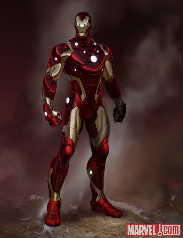
The design, according to writer Matt Fraction commented this on the armor:
“The inspiration for the new design came from thinking about a sleeker, leaner, tougher Iron Man. If technology is increasingly getting smaller and lighter it seems like the Iron Man should do the same: ergonomic and aerodynamic. We were looking for something that felt as sleek and glossy as a sports car Tony Stark would covet. I love what we've come up with. It feels like the next evolutionary step in the Iron Man's design.”
Before I comment on the design itself let me say bravo to Matt Fraction for actually taking a step in the right direction. It’s been too long since we’ve been given an aesthetic upgrade that actually looks the part. The Extremis armor and the two models directly before it were all low tech looking. The Grell armor replacing the SKIN armor was probably the last time an armor actually looked more advanced than the previous design and that was how many years ago now?
But now the design itself.
Inspiration seems to come largely from the armor from “The End” one shot a while back with its sleek lines and form fitting shape. They definitely went for something different because there really isn’t much else to compare this armor to. The faceplate seems relatively unchanged, keeping much the same shape as the extremis armor.
Frankly, my reaction (and it seems like quite a few others) is “meh.” Fraction doesn’t lie when he says it’s high tech and streamlined (no coincidence the last model to look this advanced was the Modular which shared the slim design profile) but there are some things that make the design awkward.
First are the “gaps” of gold between the red portions of the armor. On the wrists, ankles and especially the shoulders they look out of place. The gap on the shoulders give the appearance of sleeveless workout shirt, like he’s wearing something designed by the company Under Armor. I can easily picture a football players head in place of the helmet. The area around the thighs are oddly shaped, and I don't know what’s with the random red squared above the hips.
Second are the LED’s, those little balls of light. The unibeam, okay. Over the hands, okay. But the others are just seemingly there for the sake of being there. The ankles and two around the neck I think can definitely go. Initial fan reaction isn’t too high on the LED’s and I won't be surprised if down the line they are removed from the armor since things like this have happened before.
The helmet is a bit confusing to me. It may just be artist interpretation in this particular picture, but it still looks angular and flat compared to the rest of the armor which is rounded. There is also something awkward about the eyes I can't quite put my finger on, but they just look a bit alien to me.
Those are basically my two cents on this design. I’m not thrilled with it, there are too many quirky design elements that distract from it, but it is an upgrade over the extremis armor, but that wasn’t very tough since that was one of the worst looking armors. Fraction said he wants it to be advanced, and it does look the part, so we’ll see if he actually writes it that way.
Subscribe to:
Posts (Atom)
