
The design, according to writer Matt Fraction commented this on the armor:
“The inspiration for the new design came from thinking about a sleeker, leaner, tougher Iron Man. If technology is increasingly getting smaller and lighter it seems like the Iron Man should do the same: ergonomic and aerodynamic. We were looking for something that felt as sleek and glossy as a sports car Tony Stark would covet. I love what we've come up with. It feels like the next evolutionary step in the Iron Man's design.”
Before I comment on the design itself let me say bravo to Matt Fraction for actually taking a step in the right direction. It’s been too long since we’ve been given an aesthetic upgrade that actually looks the part. The Extremis armor and the two models directly before it were all low tech looking. The Grell armor replacing the SKIN armor was probably the last time an armor actually looked more advanced than the previous design and that was how many years ago now?
But now the design itself.
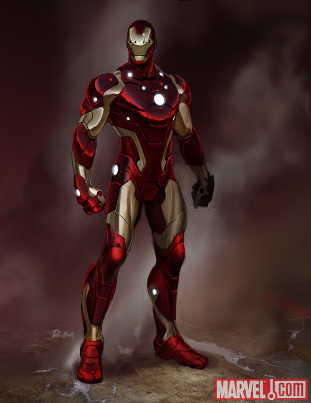
Inspiration seems to come largely from the armor from “The End” one shot a while back with its sleek lines and form fitting shape. They definitely went for something different because there really isn’t much else to compare this armor to. The faceplate seems relatively unchanged, keeping much the same shape as the extremis armor.
Frankly, my reaction (and it seems like quite a few others) is “meh.” Fraction doesn’t lie when he says it’s high tech and streamlined (no coincidence the last model to look this advanced was the Modular which shared the slim design profile) but there are some things that make the design awkward.
First are the “gaps” of gold between the red portions of the armor. On the wrists, ankles and especially the shoulders they look out of place. The gap on the shoulders give the appearance of sleeveless workout shirt, like he’s wearing something designed by the company Under Armor. I can easily picture a football players head in place of the helmet. The area around the thighs are oddly shaped, and I don't know what’s with the random red squared above the hips.
Second are the LED’s, those little balls of light. The unibeam, okay. Over the hands, okay. But the others are just seemingly there for the sake of being there. The ankles and two around the neck I think can definitely go. Initial fan reaction isn’t too high on the LED’s and I won't be surprised if down the line they are removed from the armor since things like this have happened before.
The helmet is a bit confusing to me. It may just be artist interpretation in this particular picture, but it still looks angular and flat compared to the rest of the armor which is rounded. There is also something awkward about the eyes I can't quite put my finger on, but they just look a bit alien to me.
Those are basically my two cents on this design. I’m not thrilled with it, there are too many quirky design elements that distract from it, but it is an upgrade over the extremis armor, but that wasn’t very tough since that was one of the worst looking armors. Fraction said he wants it to be advanced, and it does look the part, so we’ll see if he actually writes it that way.

No comments:
Post a Comment