
Yesterday it was announced that Marvel/Disney would be releasing the 1994 Iron Man animated series (part of the Marvel Action Hour along with the Fantastic Four) as a single DVD set that includes all twenty six episodes from both seasons. The release is scheduled for May 4, right before the release of Iron Man 2 in theatres. Regular price will be $29.99.
Well, all I have to say is: about damn time. I honestly thought this would have been released around the time of the first movie, especially after its huge success. It is a pretty reasonable price seeing as how it is both seasons.
I admit, the cartoon was not that great, especially the first season. The animation style was switched for the second season, and Force Works were dumped as supporting characters save for a few episodes. It became more like the comics, focused on Iron Man and using some of the more popular plots or issues as stories rather than totally original ones. Though why they gave Tony a mullet I will never understand.
So keep your eyes peeled for this. Pre-orders are not available at the moment, nor is it listed on Amazon or other seller sights. I won't be surprised if this goes on special though.
Here is a link to the press release:
http://www.tvshowsondvd.com/news/Iron-Man-The-Complete-Series/13275
Saturday, January 30, 2010
Tuesday, January 19, 2010
April is Iron Man Month
Well it looks like April is going to be a big month for the Armored Avenger. In anticipation of the movie Marvel is making April Iron Man month, and with it releasing a host of titles. Pictures are links due to their large size.
First off is Iron Man #25, which will herald in a new era of Iron Man, including the debut of the new armor (found below). A double sized issue with a few cover variants what direction Matt Fraction will take Stark in now that he no longer has to play along with major events like Secret Invasion and Dark Reign.
http://www.comicbookresources.com/images/solicits/marvelcomics/201004/44_INVINCIBLE_IRON_MAN_25.jpg
Iron Man Legacy #1 is a new ongoing series that will be visiting stories from the past. In other words we're going to be seeing old villains and old armors in new adventures. I wonder if this may have been partly spurned by Legacy of Doom which saw an adventure with the Neo Classic armor. My gut feeling tells me the nature of the series will lead it to be cancelled sooner rather than alter, but there is no reason to judge at this point when a single issue has yet to hit the stands.
http://www.comicbookresources.com/images/solicits/marvelcomics/201004/51_IRON_MAN__LEGACY_1.jpg
Iron Man will also be the latest hero tackled by the Noir series with Iron Man Noir #1 of 4. Set in the 1930's Tony Stark is an adventurer with a degrading physical condition. He gallivants around the world supposedly looking for a good time, but in reality is searching for a cure. The take on the armor is interesting, advanced for the time but archaic by today's standards, which is exactly what it should be.
http://www.comicbookresources.com/images/solicits/marvelcomics/201004/47_IRON_MAN_NOIR_1.jpg
Iron Man 1.5 #2 of 3 will continue the story that bridges the gap between the first and second movie. What happened after the press conference where Stark declares he is Iron Man up until the point where the new movie kicks off (which we're not quite sure of yet).
Iron Man Magazine is exactly what it sounds, filled with stories, pinups, games and the like and meant for all ages. Sounds a bit geared towards younger readers despite the all ages claim though. http://www.comicbookresources.com/images/solicits/marvelcomics/201004/46_IRON_MAN_MAGAZINE_1.jpg
There is also a new poster book that will feature thirty six different posters of our armored hero. No stories or anything like that, just pictures for us to enjoy. http://www.comicbookresources.com/images/solicits/marvelcomics/201004/48_IRON_MAN_POSTER_BOOK_1.jpg
And finally, most surprising of the new releases will be the Iron Manual Mark 3 #1. This will explore the technology of not only the Iron Man armors, but also enemies like Anton Vanko and Ezekiel Stane. I'm sure this will be as entertaining as the previous Iron Manuals. http://www.comicbookresources.com/images/solicits/marvelcomics/201004/53_IRON_MANUAL_MARK_3_1.jpg
Friday, January 8, 2010
Marvel Unveils New Iron Man Armor
For the weekend Marvel decided to impart upon us a little surprise: the new Iron Man armor which you can see right here:
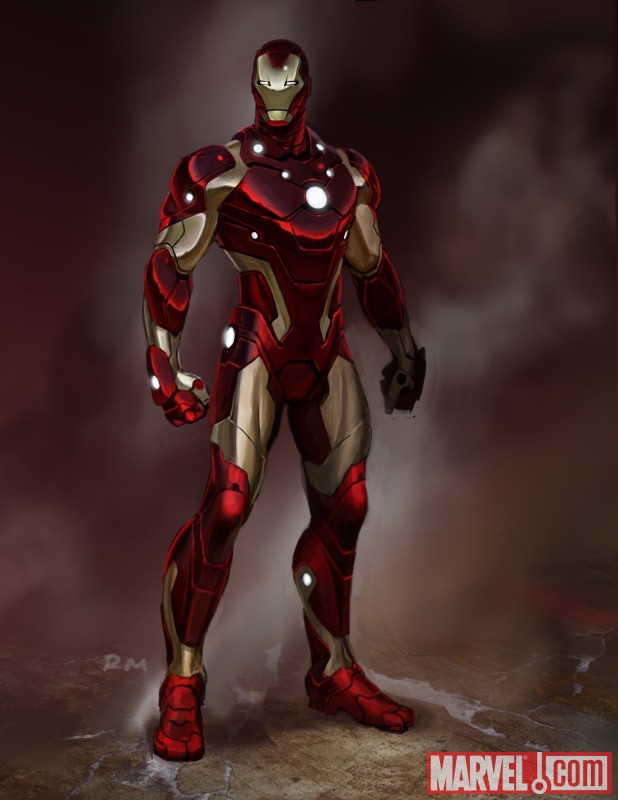
The design, according to writer Matt Fraction commented this on the armor:
“The inspiration for the new design came from thinking about a sleeker, leaner, tougher Iron Man. If technology is increasingly getting smaller and lighter it seems like the Iron Man should do the same: ergonomic and aerodynamic. We were looking for something that felt as sleek and glossy as a sports car Tony Stark would covet. I love what we've come up with. It feels like the next evolutionary step in the Iron Man's design.”
Before I comment on the design itself let me say bravo to Matt Fraction for actually taking a step in the right direction. It’s been too long since we’ve been given an aesthetic upgrade that actually looks the part. The Extremis armor and the two models directly before it were all low tech looking. The Grell armor replacing the SKIN armor was probably the last time an armor actually looked more advanced than the previous design and that was how many years ago now?
But now the design itself.
Inspiration seems to come largely from the armor from “The End” one shot a while back with its sleek lines and form fitting shape. They definitely went for something different because there really isn’t much else to compare this armor to. The faceplate seems relatively unchanged, keeping much the same shape as the extremis armor.
Frankly, my reaction (and it seems like quite a few others) is “meh.” Fraction doesn’t lie when he says it’s high tech and streamlined (no coincidence the last model to look this advanced was the Modular which shared the slim design profile) but there are some things that make the design awkward.
First are the “gaps” of gold between the red portions of the armor. On the wrists, ankles and especially the shoulders they look out of place. The gap on the shoulders give the appearance of sleeveless workout shirt, like he’s wearing something designed by the company Under Armor. I can easily picture a football players head in place of the helmet. The area around the thighs are oddly shaped, and I don't know what’s with the random red squared above the hips.
Second are the LED’s, those little balls of light. The unibeam, okay. Over the hands, okay. But the others are just seemingly there for the sake of being there. The ankles and two around the neck I think can definitely go. Initial fan reaction isn’t too high on the LED’s and I won't be surprised if down the line they are removed from the armor since things like this have happened before.
The helmet is a bit confusing to me. It may just be artist interpretation in this particular picture, but it still looks angular and flat compared to the rest of the armor which is rounded. There is also something awkward about the eyes I can't quite put my finger on, but they just look a bit alien to me.
Those are basically my two cents on this design. I’m not thrilled with it, there are too many quirky design elements that distract from it, but it is an upgrade over the extremis armor, but that wasn’t very tough since that was one of the worst looking armors. Fraction said he wants it to be advanced, and it does look the part, so we’ll see if he actually writes it that way.
Subscribe to:
Comments (Atom)
