
http://s590.photobucket.com/albums/ss343/IrOnPaTrIoT/?action=view¤t=RMIN.jpg
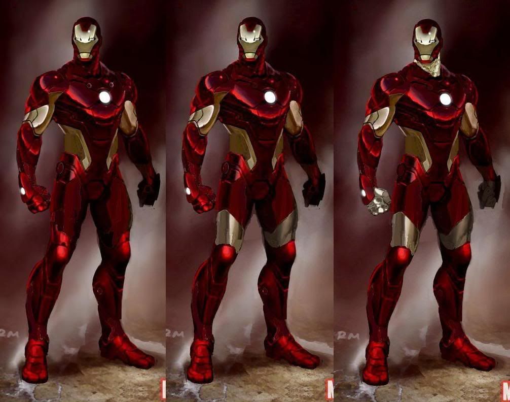
3) Covering only one part of the body and not another
There are three instances of this: the triceps are covered and not the biceps; the back of the thighs are covered and not the front; and the fingers are covered but not the thumb. I cannot figure out a reason for this at all. They are awkward, and while not enough to ruin the design it would no doubt look better should these things were either fully covered or not at all.
2) Gaps in the red
Culprits include the shoulders, forearms, ankles and back. Especially the back. There is no rhyme or reason why there are gaps there, being little more than distracting. The back especially makes the armor look like it is a suit to wear to the gym rather than fight in. I keep thinking that Under Armor designed this particular suit because of it. It looks like the suit is wearing a workout shirt and lifting gloves. I think the red sections are supposed to coincide with human muscles groups, but regardless it is very distracting and impractical.
1) LED’s
I do not care if these actually have function (which I have a feeling they do not) they need to go. Placed in random places (inside ankles, shoulders to name a few) they attempt to give the suit a high tech feel by placing lights all over the armor. Unfortunately, the attempt fails. Some fans say they are meant for flight stabilizing or weapons discharge, but that theory does not hold up too well because of the odd placement. On the inside ankles is about the last place you want weapons firing and it will not help in flight stabilization much. In addition, what would be the need of having six LED’s on the chest? The hips I do not think make much sense either.
So there are three things that myself and others feel would make the armor look much better. I get they want something futuristic, but they make the same mistake that many make when predicting the future: people will not abandon practicality. Looking at this armor reminds me of seeing an old 1950’s video predicting what things would look like in the 2000’s. Those predictions were not even close to be right, because why would people abandon something that works? This futuristic attempt does not work because it is not practical, and frankly in some ways is outright screwy.
Linked below are my attempts at a photoshop (excuse my poor skills) that would to introduce these three fixes into the armor.
http://i134.photobucket.com/albums/q109/JWeigler/ArmorComparison-2.jpg?t=1263244535

No comments:
Post a Comment